Stephen Hawking’s ‘A Brief History of Time’ is one of the most important books of the 20th century and for very good reasons. It helps us understand fundamental questions of physics and our existence, it takes us on a journey from the beginning of the universe to its possible end, and it even carries us into the depths of a black hole. It is a true book with purpose.

This post gives an overview of our approach to visual development of the app, and the challenges we faced in bringing to life some of the most complex content we’ve ever worked with.

Art direction

The biggest artistic challenges was to come up with an illustration style that allowed us to communicate various scientific concepts. The style had to be flexible enough to allow us to convey a few different ideas: from the physics of the very small to the very big; from the very abstract to the more representational. All of these in a form that was both beautiful and could be drawn quickly.

With ‘Pocket Universe’ we also aimed to achieve a look and feel that would be appreciated not just by people interested in science and technology, but also by people who enjoy art and design.

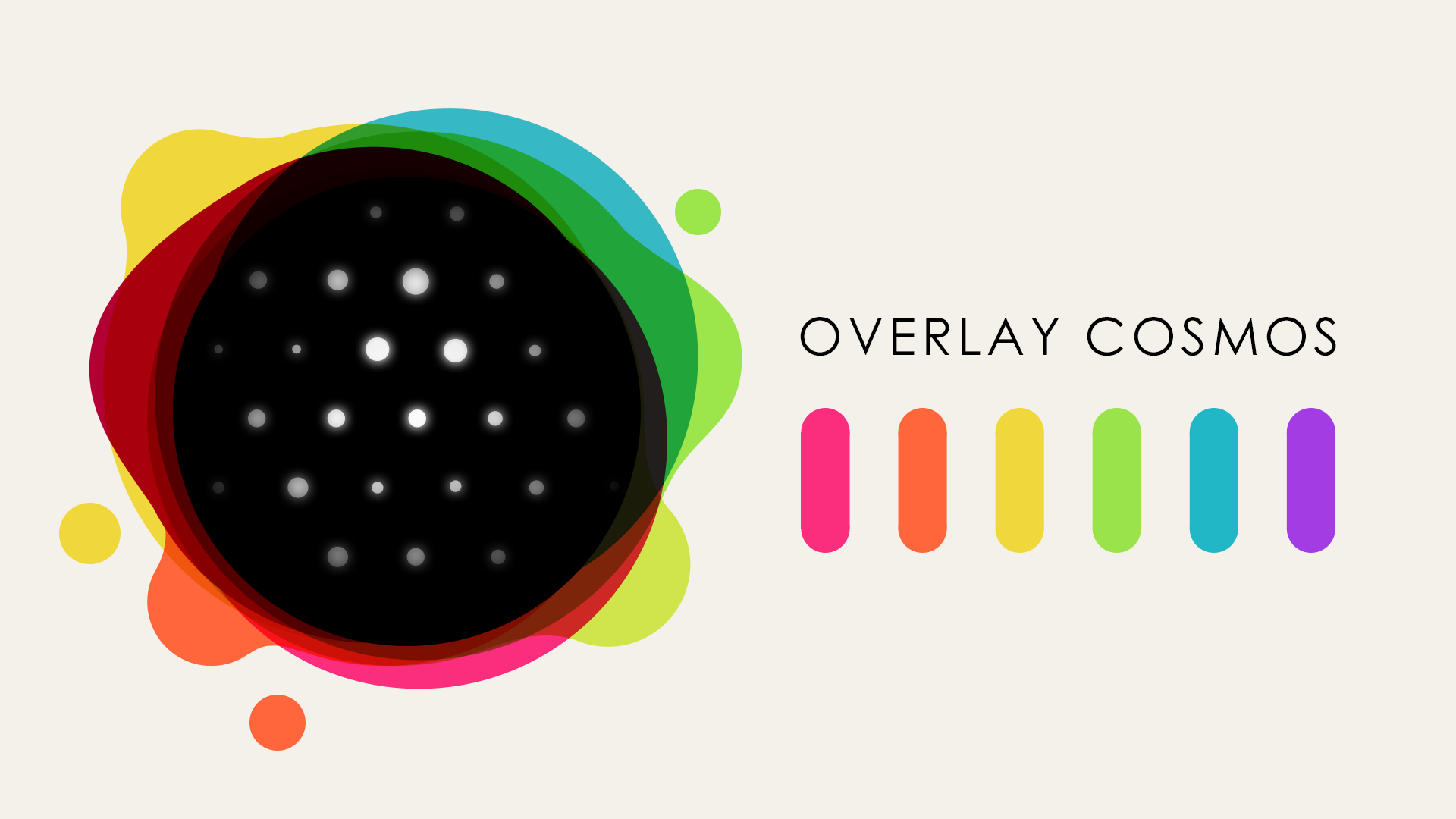
Usually when we think of the cosmos we think of a black sky with white stars. In fact, our first attempts for Art Direction explored this with a minimal black and white look, but then we realised that in colour theory, black and white can both be the combination of all colours or the absence of them. I imagined a picture of the universe where you see on the edges all the layers of what it’s composed of. This related nicely with physics theories, as it feels like the universe can be described through a series of theories that work together, in different layers, at different scales. So fluid additive colour became a big part of our look based on this metaphor. We called this approach Overlay Cosmos.
The interface

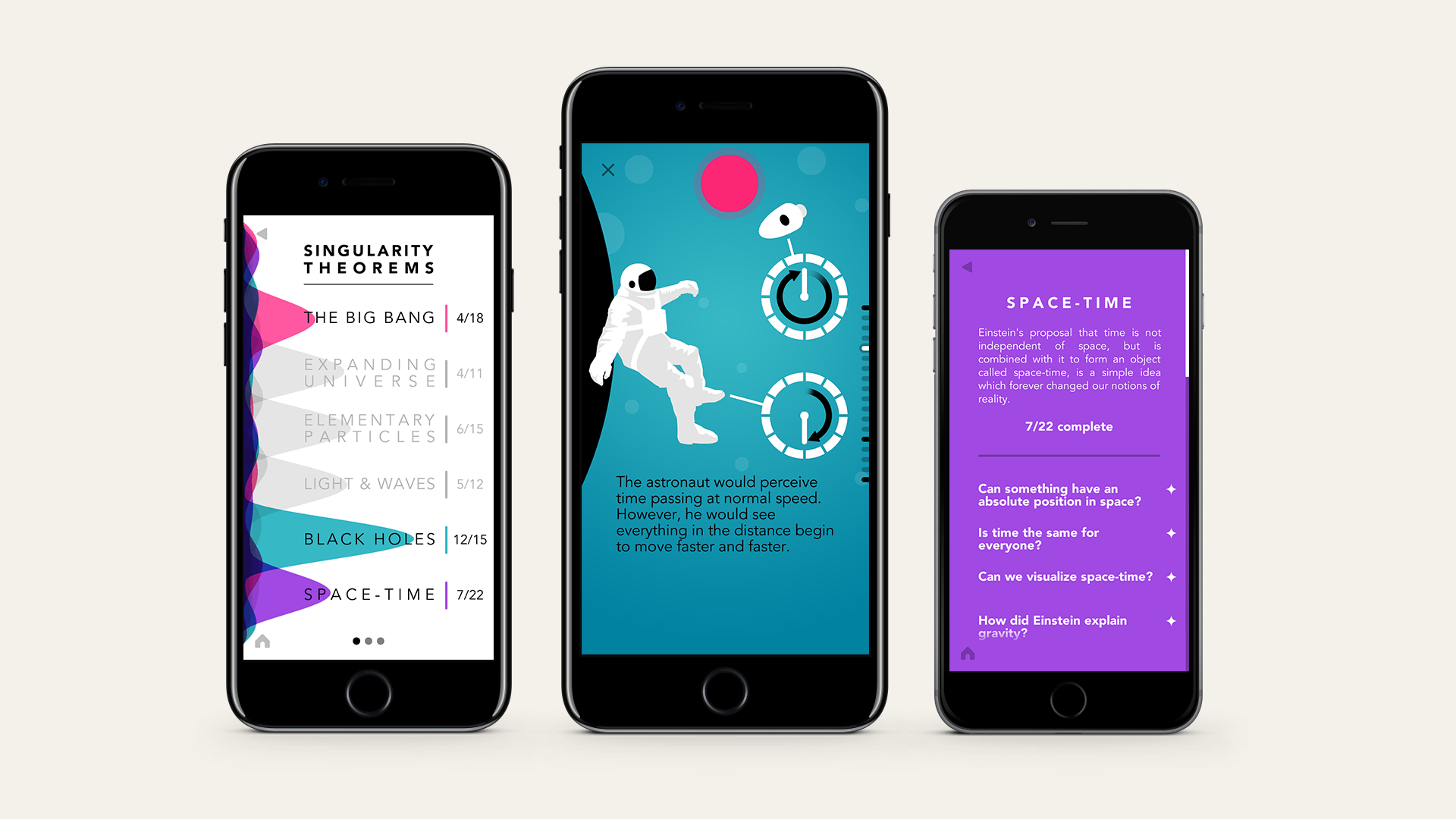
Our designer came up with an innovative approach to structure the app around Stephen Hawking’s scientific contributions: Singularity Theorems, Hawking Radiation and No Boundary Proposal.

The topics and chapters would be filtered depending on which scientific contribution was selected. Topics would be colour coded and palettes would form around different contributions. Something interesting about this approach is that the colour defines which topics relate to Stephen Hawking’s different contributions but it also shows how different topics inform more than one theory.

The gateway to all topics is through the contribution carousel, where we can see a brief description of Stephen Hawking’s contributions. Once selected, its layers ripple and reform to show the individual topics that relate to it. Selecting a contribution fills up the whole screen with a colour related to the topic.

The narratives

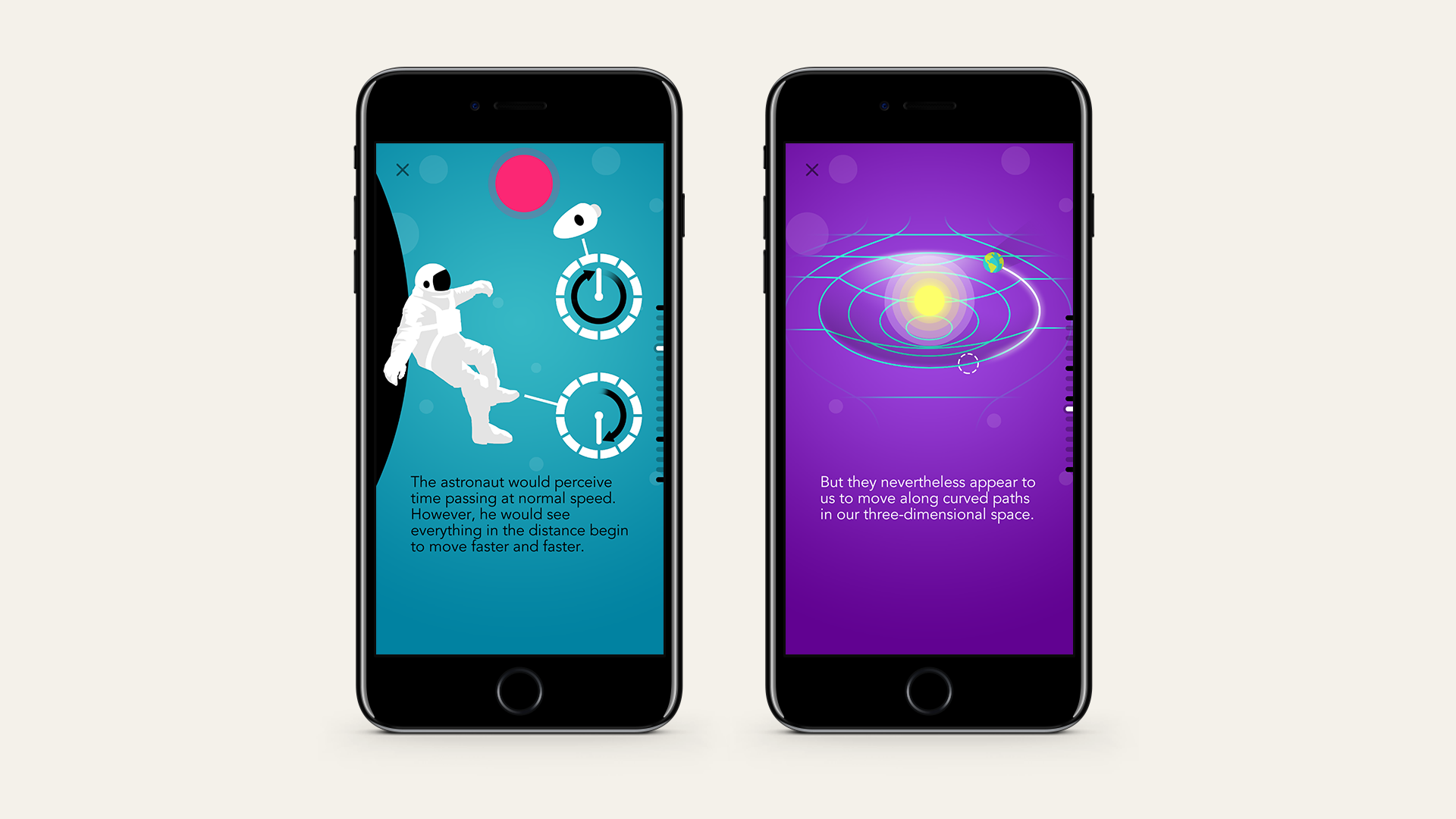
Because we needed to work fast, we created a pipeline that allowed us to quickly illustrate ideas and bring them into the app. We began by breaking up the text into digestible chunks, and then storyboarding visuals to accompany these bits of text. This sounds simple, but it is actually a lot of work because of the content we are trying to communicate. The visuals must make scientific sense and also help the reader understand the concepts without distracting or confusing.

Once the storyboards were in a good place we would create full illustrations in Photoshop. In Photoshop we created guides and grids to help speed up the illustration process and to make sure we used the screen space smartly. We also had to use specific folder naming and structure so that once finished we could export layers of the illustration automatically to achieve the finished parallax scrolling effect.

Conclusion

Working on a new version of something so iconic was intimidating. The trick was to remember that we were working on something that is already great. All we had to do was to remain faithful to the material and not be afraid to explore new ways of representing it.

We are very proud of the end result. ‘Pocket Universe’ is a colourful and beautiful app with over 700 new illustrations that work together with the text, and help readers understand the content more than ever. Penguin Random House was so happy with our art direction that for the physical books new ‘updated edition’ and the audiobook they had their art team design the new covers based on our work. We cannot think of a better compliment.

The app can be downloaded on the App store here.

Manuel Harari

Manuel is a Lead Artist at PRELOADED.