Our approach
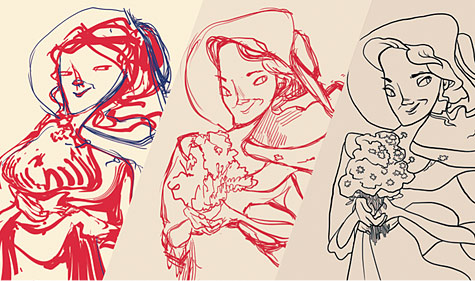
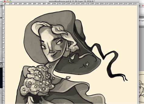
Considering the number of cards required, it was important that the process was as simple as possible.
Originally we thought that having a black and white palette was the way to go, eliminating a colouring stage and ultimately becoming less time consuming. After a couple of tests, we all agreed that this would make the cards dull and underwhelming.
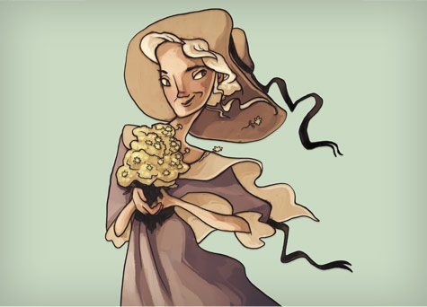
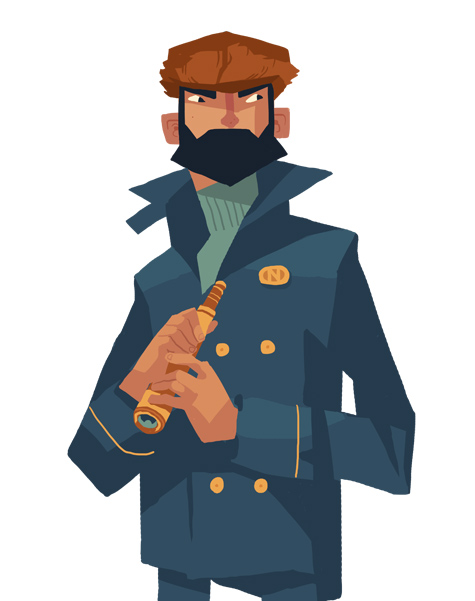
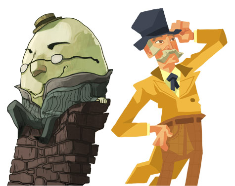
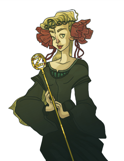
What we eventually agreed on was a reduced palette, using a selection of only 3 colours. This proved beneficial for the art style, ensuring the game’s art direction felt more balanced and considered.
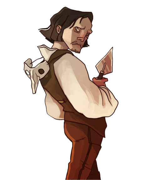
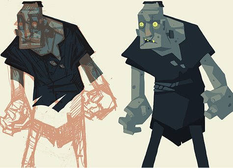
To ensure the characters were visually unpredictable and interesting, I added distortion and exaggeration to their features. In the early development of the style it became apparent that cards with interesting poses and stances were more appealing and this became a very helpful way of portraying personality and character.

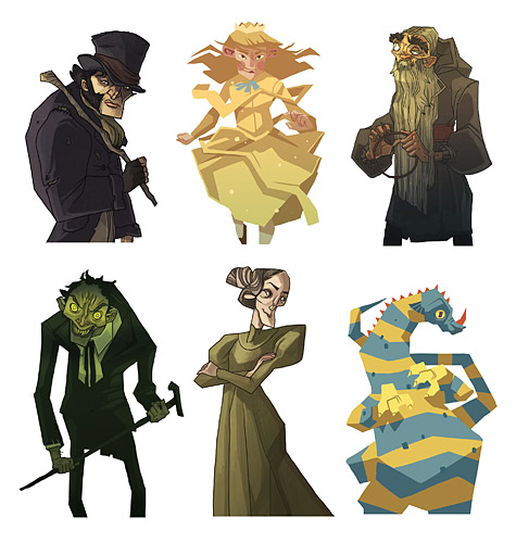
6 characters you can unlock in the game.
There were many times I made characters more theatrical to really push for that initial impression, so players could instantly read if a character was sinister, kind, wacky etc.
We needed to factor in that many kids would see characters in battles from books they haven’t read yet. Adding a small element of storytelling and an inviting sense of mystery and drama to each character would hopefully encourage players to seek out these characters and their stories and, ultimately, read their books.
Avoiding the typical portrayal of famous literary characters was essential. The illustrations needed to be unique and surprising, challenging the reader’s perception of the character so that they always anticipated receiving a new card.

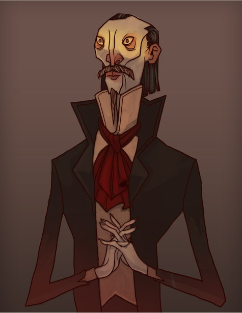
Count Dracula.

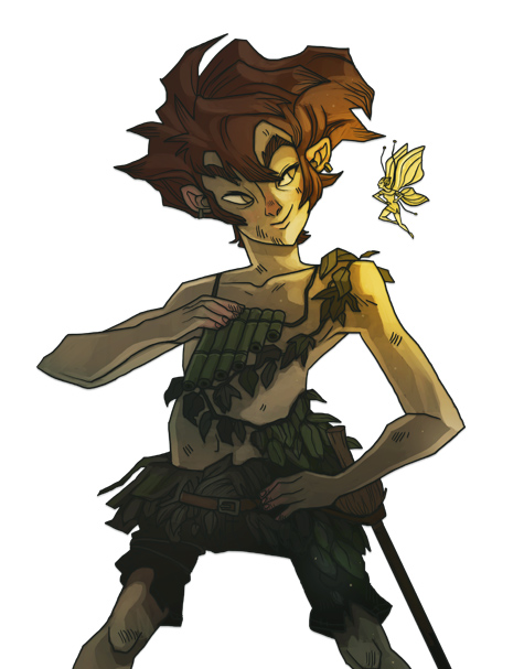
Peter Pan.
